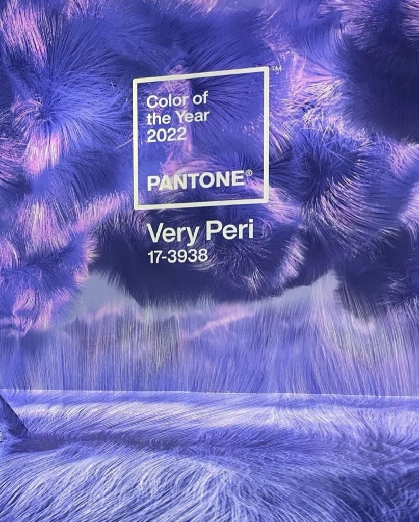
PANTONE
COLOR OF THE YEAR
Role: Art Direction / Design / Animation
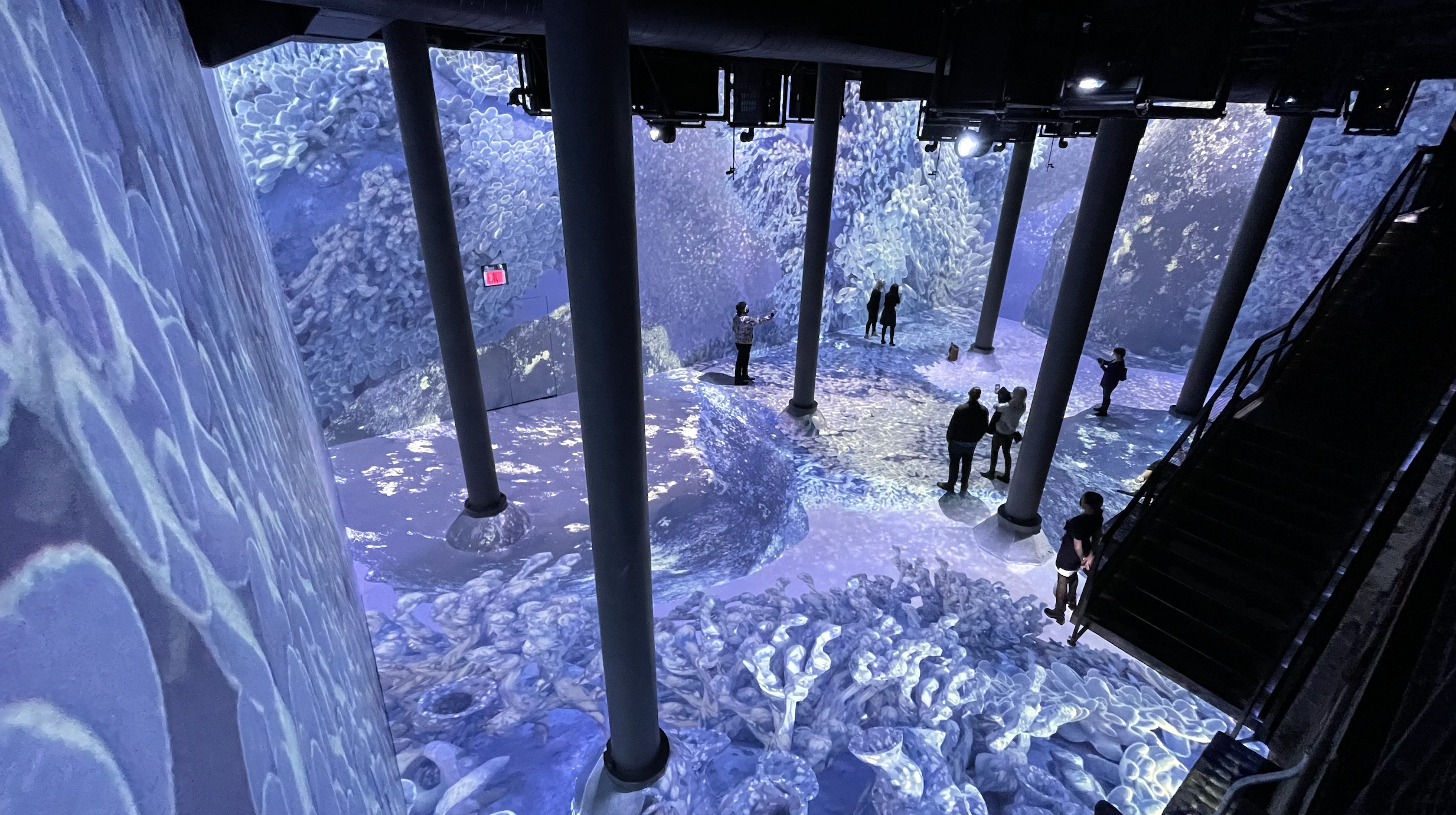
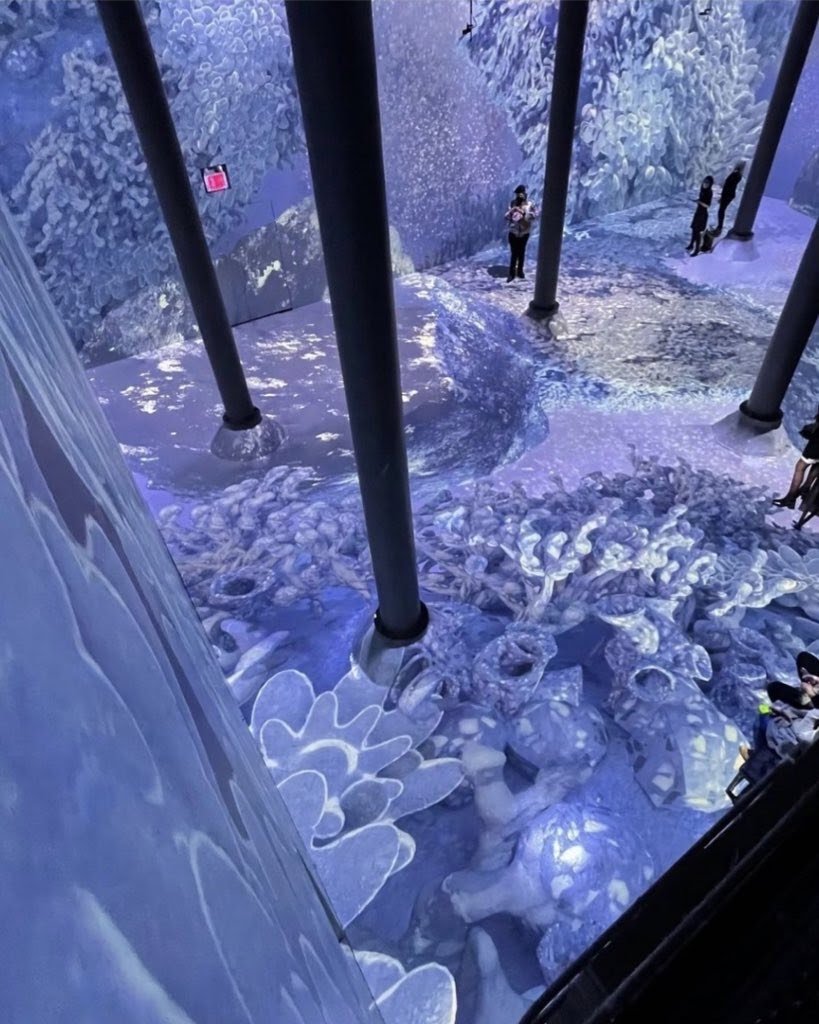
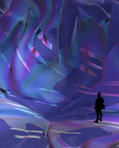
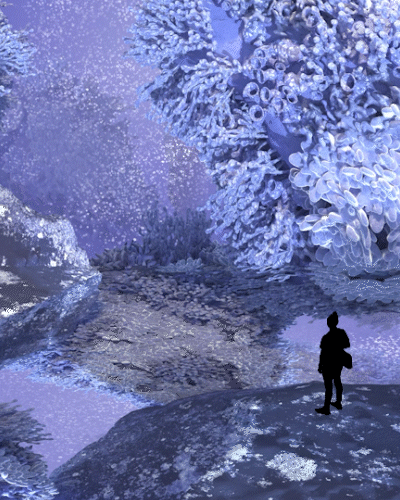
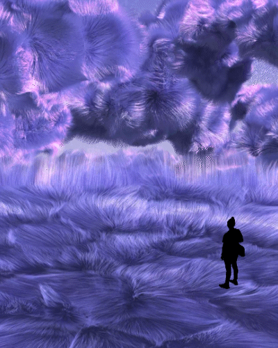
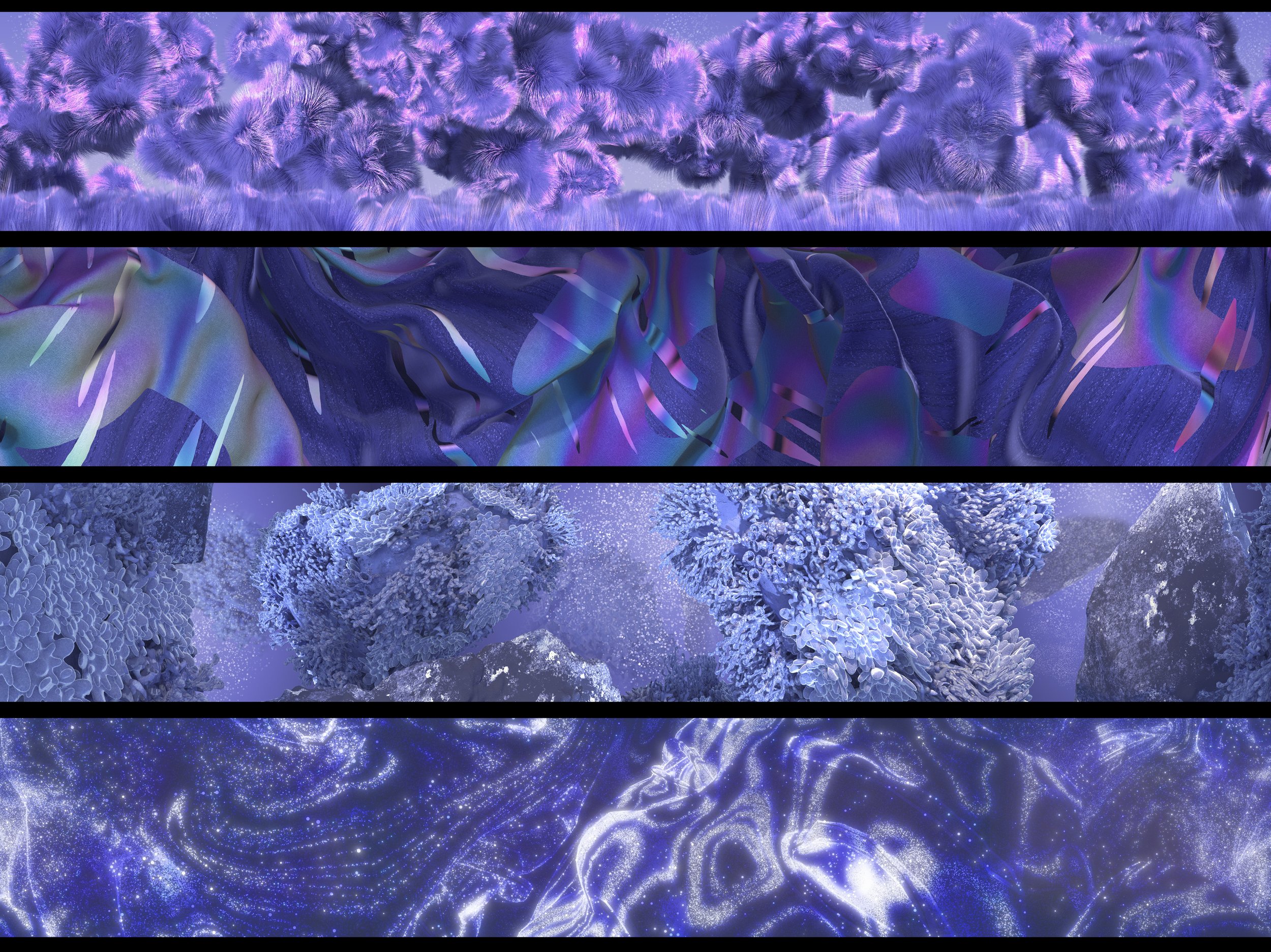
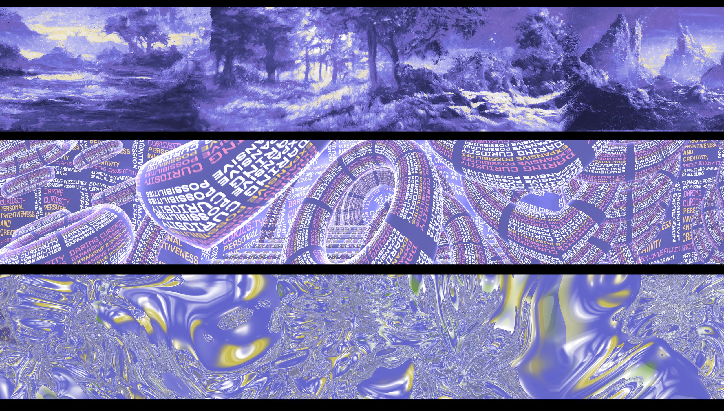
I collaborated with the ARTECHOUSE crew to celebrate the new Pantone color of the year Very Peri. Concepting, Design and Animation for 15mins of content in 1 month, with media surfaces ranging in the +20k ranges. It was a magical beast to get done, but I really enjoyed the challenge and opportunity.
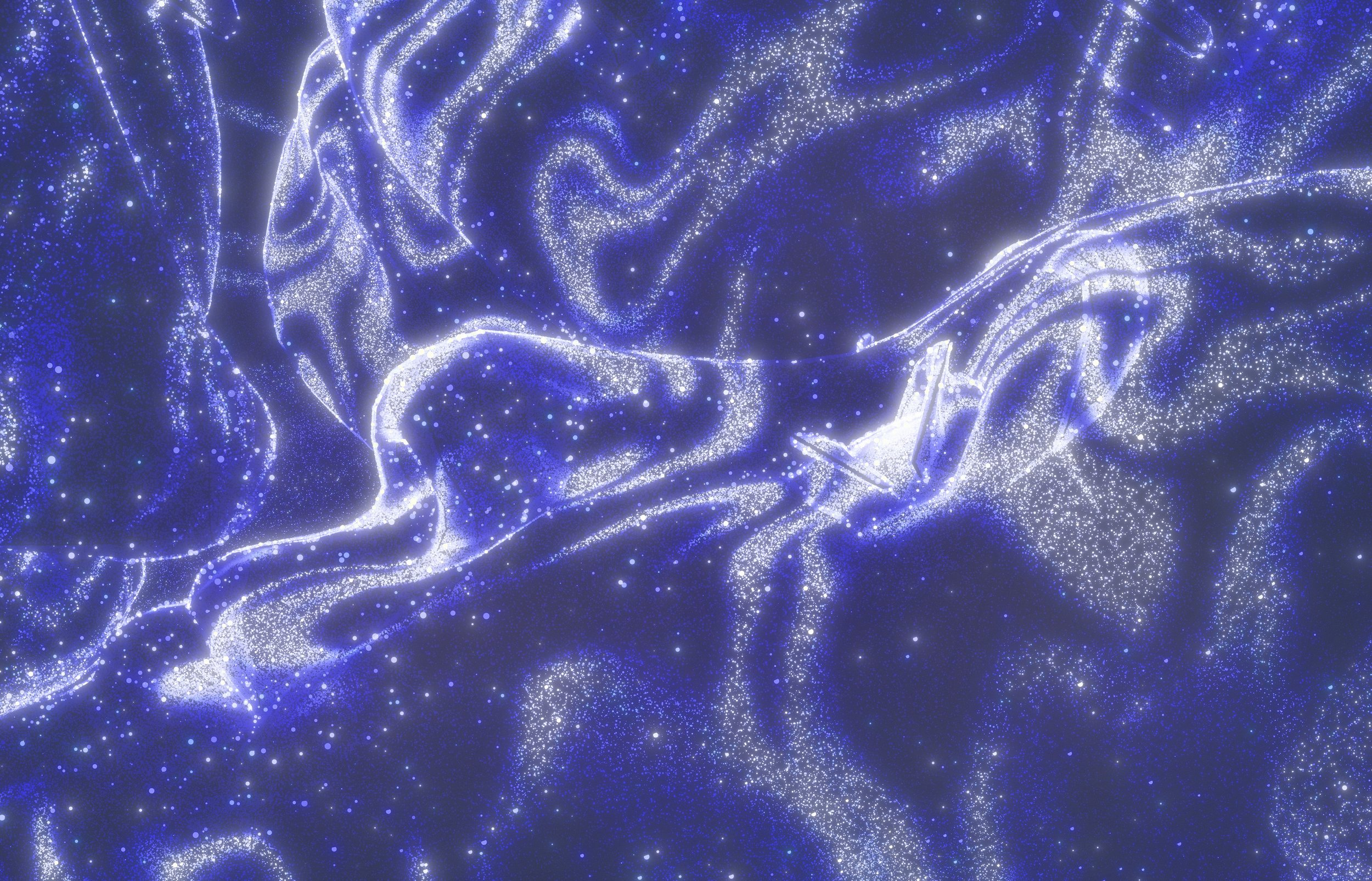
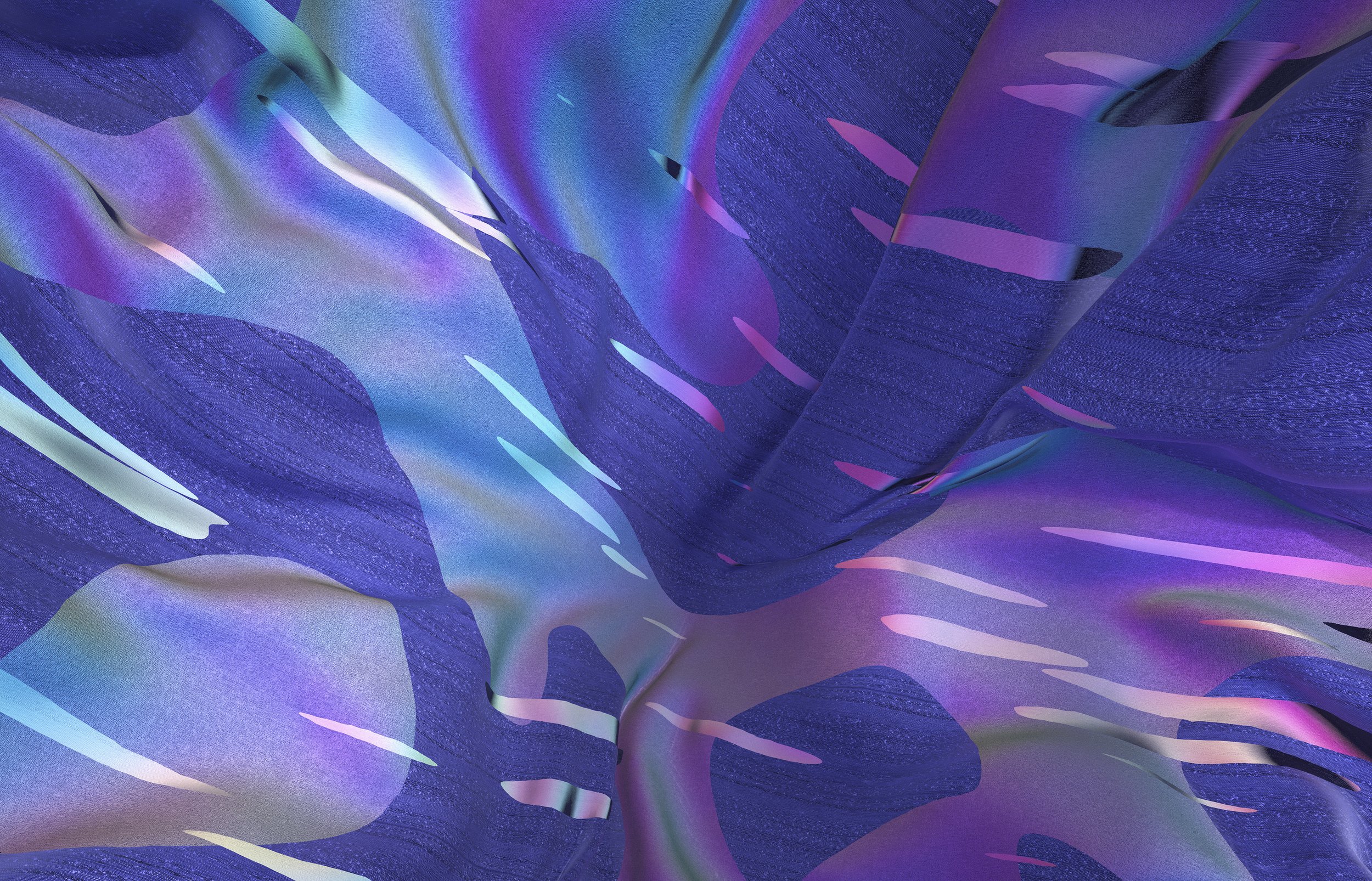
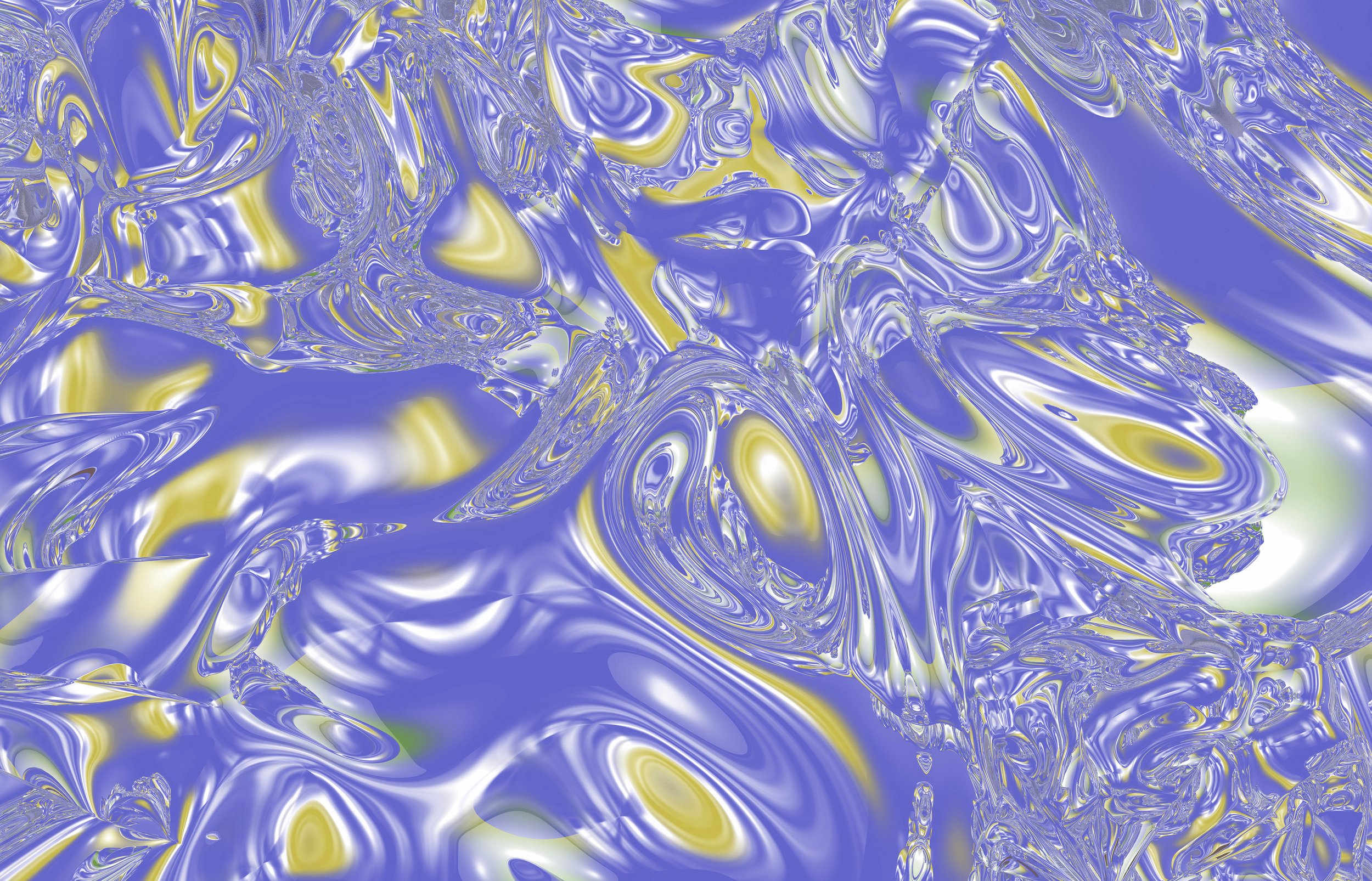
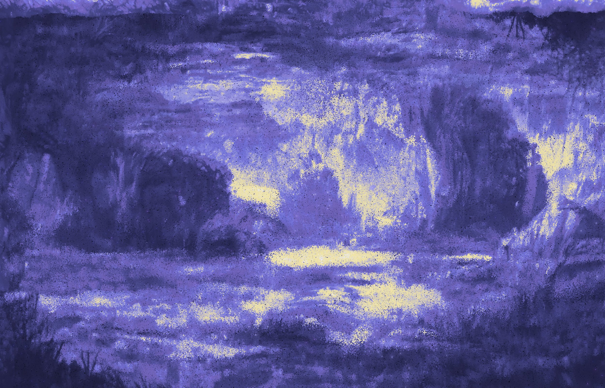
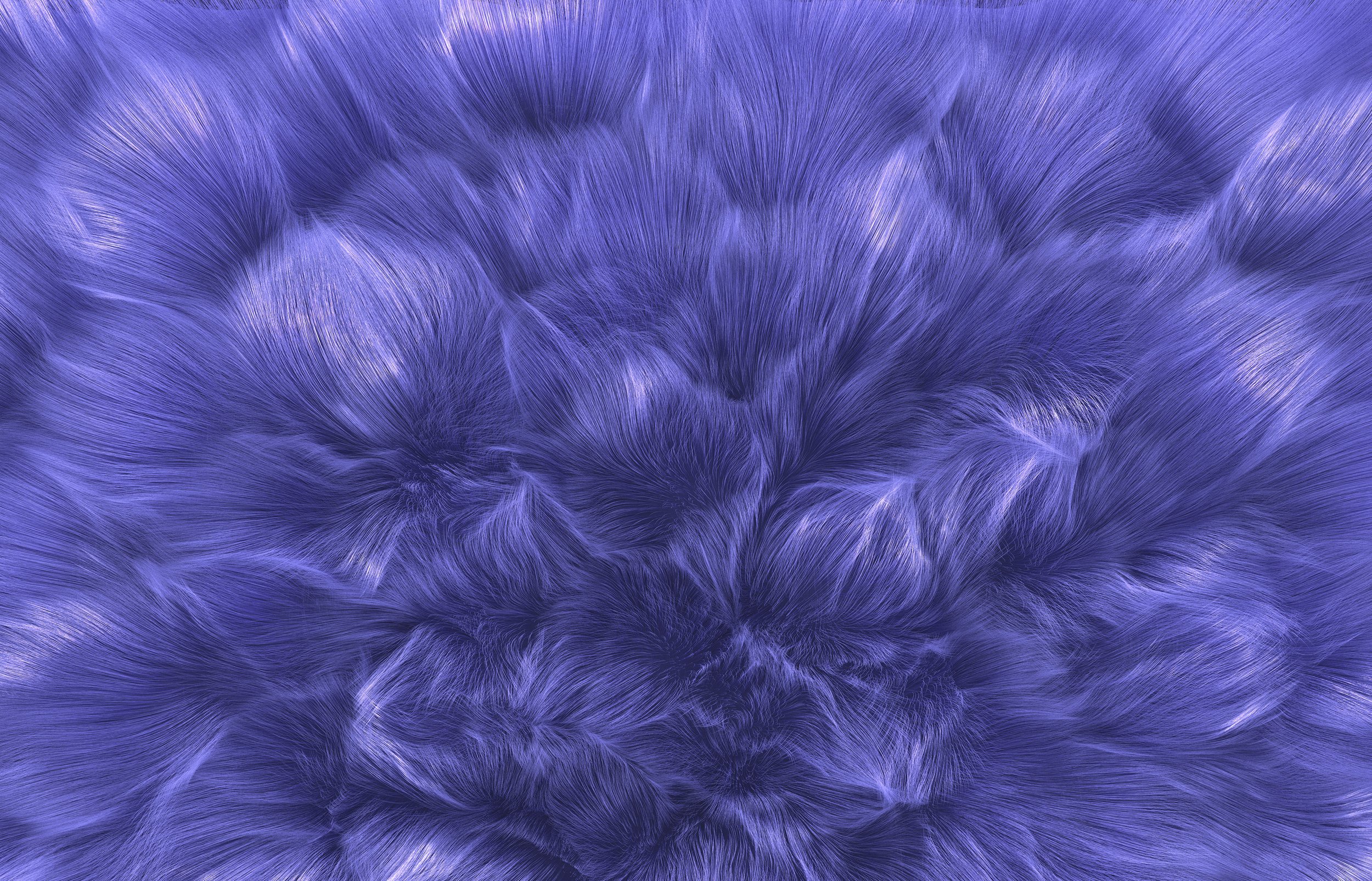
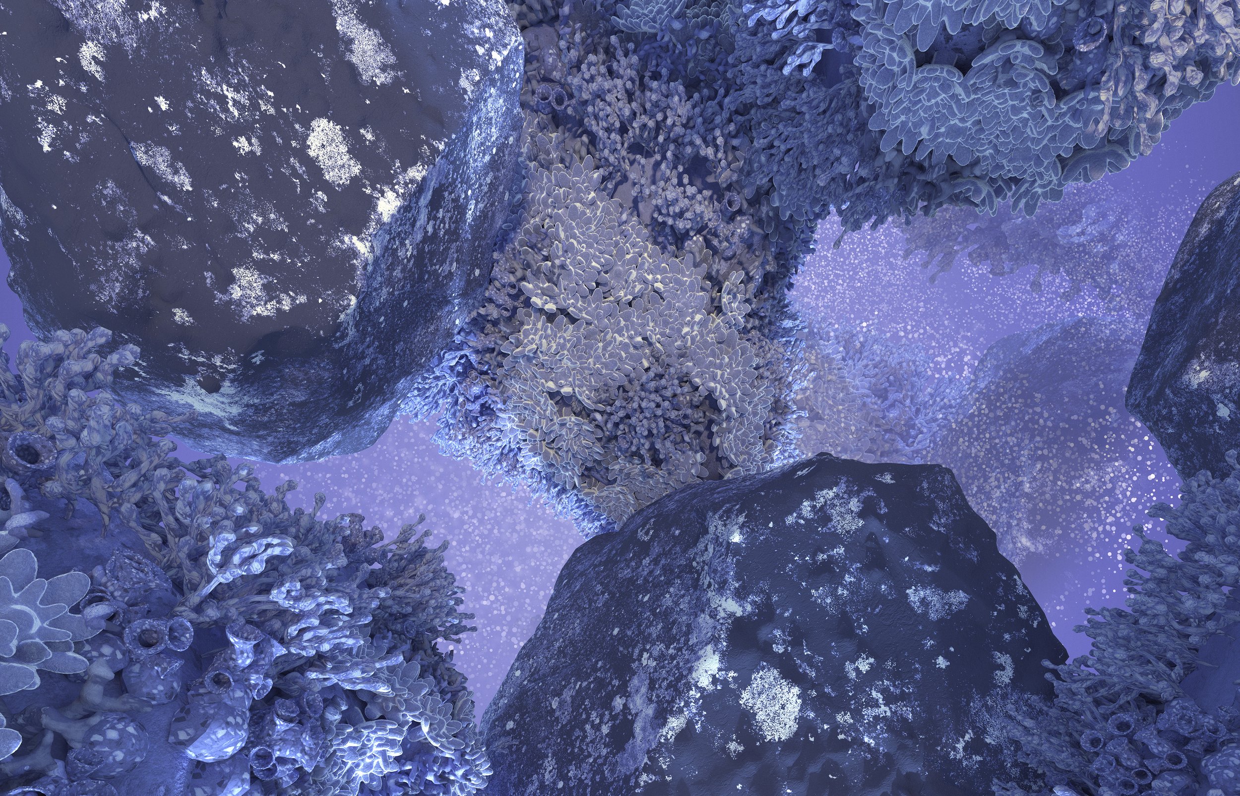
We are living in transformative times. As we emerge from an intense period of isolation, our notions and standards are changing. Displaying a carefree confidence and a daring curiosity that animates our creative spirit, inquisitive and intriguing PANTONE 17-3938 Very Peri helps us to embrace this altered landscape of possibilities, opening us up to a new vision as we re-write our lives. Rekindling gratitude for some of the qualities that blue represents complemented by a new perspective that resonates today, PANTONE 17-3938 Very Peri places the future ahead in a new light.
Design
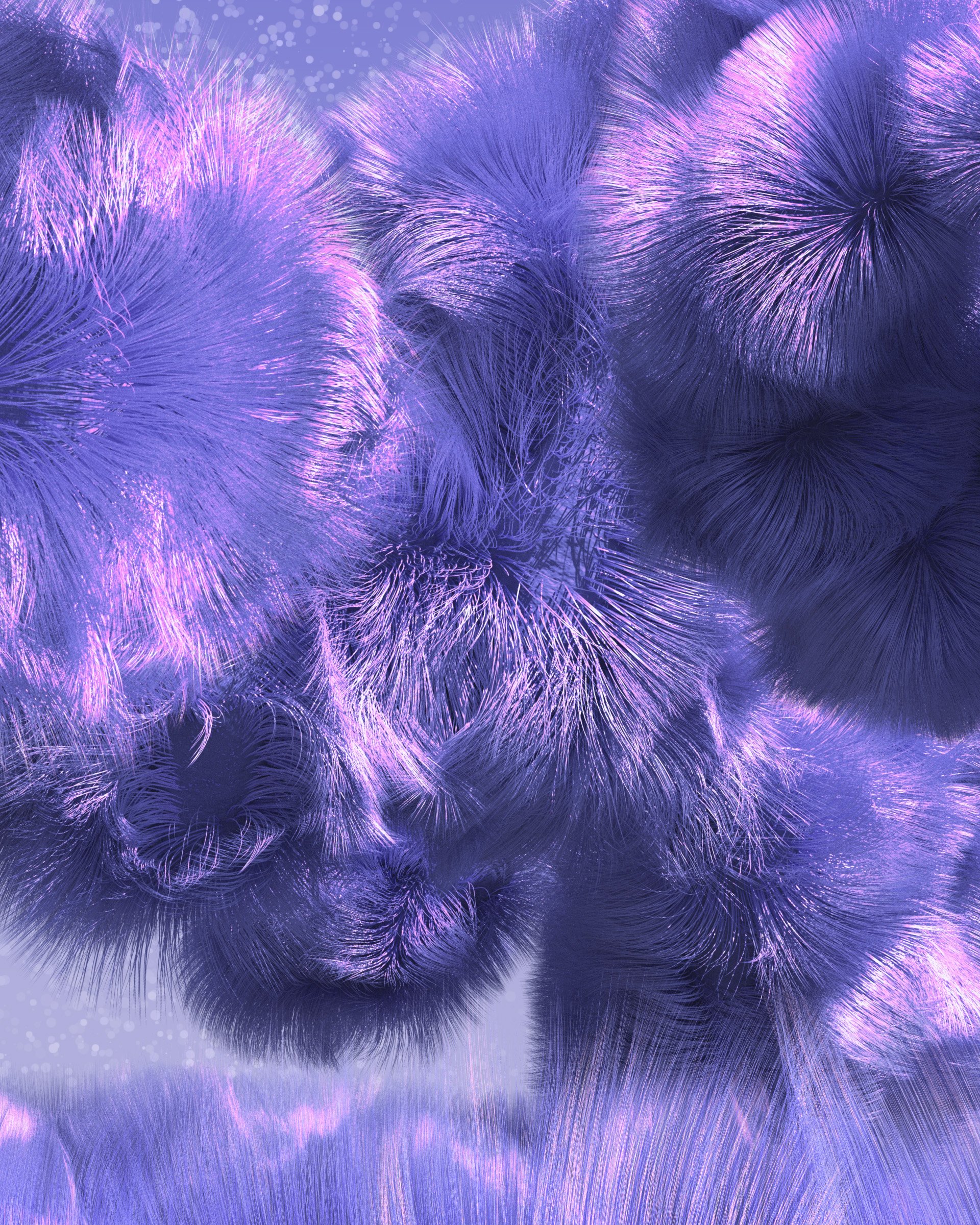
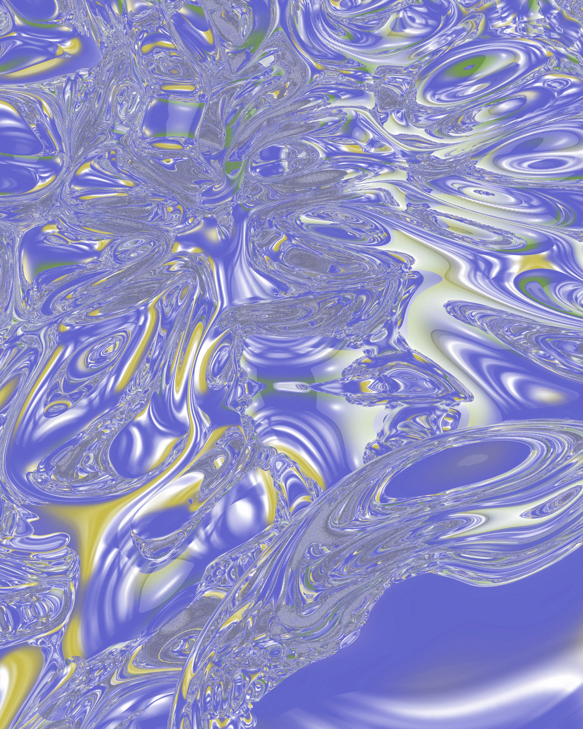
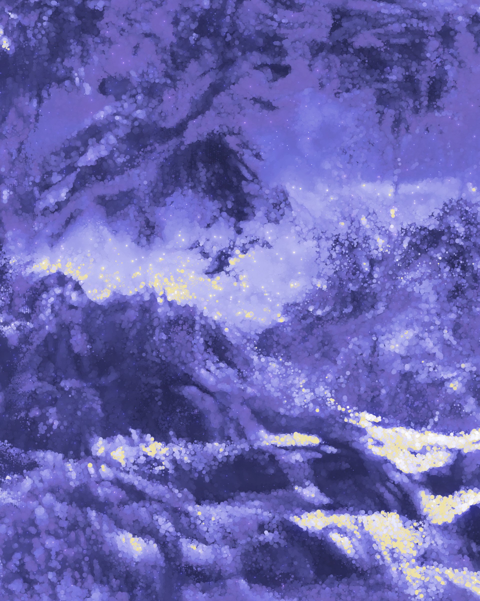
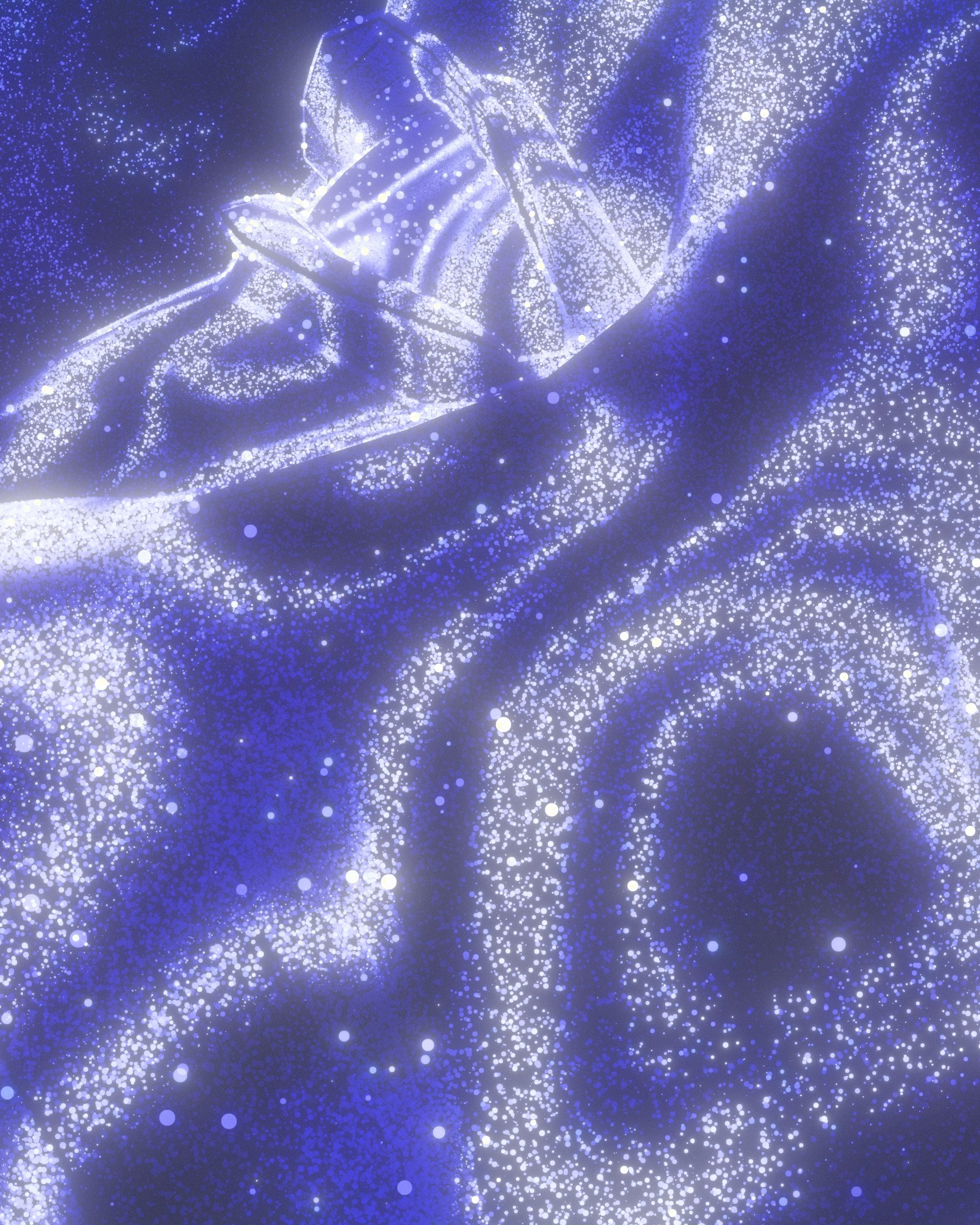
Pantone’s description of the new color Very Peri included some beautiful terms to act as jumping off points for visual development.
”Altered Landscape of Possibilities” “Personal Inventiveness and Creativity” “Expansive Possibilities” to name a few.


Credits
Client
Artechouse, Pantone
Art Direction Design Animation
Emmett Feldman